


If you've fallen for Dulux Egyptian Cotton and you're now standing in front of a colour wheel wondering what goes with it, you're not alone. Egyptian Cotton (colour code 40YY 65/061) is one of Dulux's most popular soft neutrals precisely because it plays so well with others. But "neutral" doesn't mean "safe and boring." Get the pairing right and this warm, creamy beige becomes the backbone of a genuinely stylish room. Get it wrong, and even a good neutral can look flat or muddy next to the wrong colour.
In this guide we'll walk through the best colour pairings for Egyptian Cotton, why they work, and how to carry the shade through from walls to woodwork using the right Dulux finishes. Whether you're painting a single feature wall, a whole living room, or coordinating a kitchen and hallway, the same underlying principles apply. It's simply a case of knowing which colours amplify Egyptian Cotton's warmth and which ones sit alongside it as gentle contrast. You can browse the full Dulux Egyptian Cotton collection at Essentials Fix while you plan your scheme.
Why Egyptian Cotton Works as a Coordinating Neutral
Egyptian Cotton has a hex value of approximately #D9D2C5 (RGB 217/210/197) and a Light Reflectance Value (LRV) of 66%, which places it firmly in the soft-neutral middle ground, light enough to keep a room feeling airy, but with enough depth that it doesn't wash out like a pure white. What makes it such a flexible base colour is its subtle warm, yellow undertone. It reads as a gentle, creamy beige rather than a cold, grey-leaning neutral, which is exactly why it sits so comfortably alongside such a wide range of other colours.
Marianne Shillingford, Dulux's Creative Director and Colour Expert, described Egyptian Cotton in Ideal Home as "the perfect neutral colour that makes everything you have in your home look coordinated no matter what your style is," and that's really the heart of this shade's appeal. It isn't trying to be the star of the room; it's designed to make everything around it look intentional, whether your style is traditional, coastal, Scandinavian, or contemporary.
Best Colour Pairings for Egyptian Cotton
Soft Greys
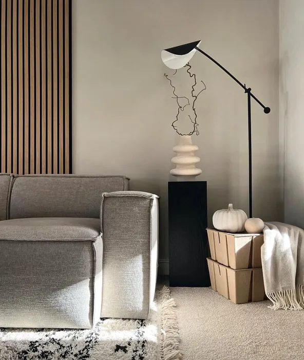
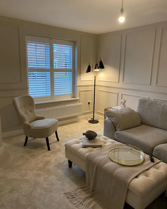
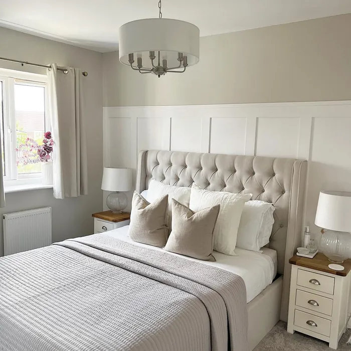
Because Egyptian Cotton carries a warm undertone, it's an excellent partner for soft, cool-leaning greys. The warmth in the beige stops a grey scheme from feeling cold or clinical, while the grey adds a more contemporary, tonal edge to Egyptian Cotton's cosiness. This pairing works particularly well when you want a calm, layered neutral palette. Think a grey sofa against Egyptian Cotton walls, or grey cushions and throws layered over Egyptian Cotton bedding. The two shades sit close enough in tone to feel harmonious, but different enough to add gentle contrast and depth rather than blending into a single flat block of colour. This is one of the most popular pairings for living rooms and bedrooms, since it delivers a calm, contemporary feel without tipping into a scheme that feels stark or overly cool.

Warm Whites & Creams
Sticking within the same warm family is one of the simplest ways to get a coordinated look. Warm whites and creams echo Egyptian Cotton's yellow undertone rather than fighting it, which is ideal for ceilings, skirting, architraves, or an adjoining room you want to feel connected without being identical. This is a classic approach for hallways and open-plan spaces, where you want colour continuity from room to room without every wall being the exact same shade.

Natural Wood Tones
Egyptian Cotton's soft, warm base makes it a natural match for pale and mid-toned natural wood (oak, ash, and other light timbers in particular). The wood's own warm undertones sit comfortably alongside the paint rather than competing with it, which is why this pairing turns up so often in Scandinavian-inspired and modern-rustic interiors. Exposed floorboards, wooden furniture, and open shelving all read as part of a considered, cohesive scheme against Egyptian Cotton walls rather than standing out as a mismatched accent.

Deeper Browns & Black Accents
For a more grounded, contemporary look, pair Egyptian Cotton with deeper browns or black accents. Because Egyptian Cotton sits at a mid-range LRV of 66%, it has enough presence to hold its own next to darker tones without disappearing, while the darker accent brings definition and a sense of structure to the room. This works well used sparingly (a black-framed mirror, dark wood furniture, or a deep brown accent chair), so the room still feels light and warm overall, with the darker tones acting as anchor points rather than dominating the palette. It's a particularly effective approach in living rooms and studies, where a little tonal weight helps a warm neutral scheme feel considered rather than washed out.

Stone, Clay & Plaster-Effect Textures
Egyptian Cotton also pairs beautifully with stone, clay, and plaster-effect finishes. These textural, earthy materials share a similar warm, muted quality, which is why the combination feels so natural. Nothing clashes because everything sits within the same soft, warm family of tones. If you're leaning into a more textural, organic interior (limewashed walls, stone flooring, clay-toned soft furnishings), Egyptian Cotton is a strong, flexible wall colour to build the rest of the scheme around.

Egyptian Cotton with Metal and Hardware Finishes
Once the wall colour and larger furnishings are settled, hardware and metal finishes are what tie a room together at the detail level. As a general rule in interior design, warm neutrals like Egyptian Cotton pair well with black ironmongery (door handles, light fittings, curtain poles), because the black provides crisp, confident contrast against a soft backdrop without introducing a new colour into the mix. Bronze and other warm metallics are another natural fit, since their warmth echoes the undertone in Egyptian Cotton itself, creating a more cohesive, tonal look rather than a contrasting one. Both approaches work; the choice really comes down to whether you want your hardware to stand out (black) or blend in (bronze).

Coordinating Your Trim with Quick Dry Satinwood
One of the easiest ways to get a truly coordinated room is to keep your trim, skirting boards, and woodwork in the same colour family as your walls, rather than defaulting to plain white. Dulux Quick Dry Satinwood 750ml in Egyptian Cotton is designed exactly for this, a durable satinwood finish for doors, skirting, and other woodwork that lets you match your trim precisely to your Egyptian Cotton walls, or use it as a subtle tonal contrast against one of the pairings above. A tonal trim like this softens the line between wall and woodwork, which suits Egyptian Cotton's understated, coordinating character far better than a stark white contrast would.

If you're painting walls and trim together, it's worth ordering a tester pot first (Essentials Fix sells a 30ml Egyptian Cotton tester) so you can see exactly how the wall and woodwork finishes sit next to each other in your own space before committing to full tins. For the walls themselves, both Dulux Matt 2.5L and Dulux Silk 2.5L are available in Egyptian Cotton, depending on the finish you prefer.
A Note on Lighting
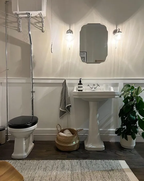
Before you settle on a final palette, it's worth remembering that Egyptian Cotton (like any paint colour) shifts depending on the light it's viewed in. Under warm artificial lighting, it takes on a deeper, "raw cashmere" warmth, leaning further into its creamy, golden character. In cool, north-facing daylight, on the other hand, its softer grey undertones come forward, and the colour can read noticeably cooler and more muted.
This matters for pairing decisions because a combination that looks perfectly balanced in one room may read slightly differently in another, depending on aspect and light source. It's also worth bearing in mind if you're choosing between Egyptian Cotton and a lighter neutral like Dulux Timeless (LRV 87): Timeless is a lighter, softer off-white, while Egyptian Cotton is the deeper, more pigmented option of the two. Always view your chosen colours (and any pairing) on the actual wall, at different times of day, before committing.
Bringing It All Together
Egyptian Cotton earns its reputation as a coordinating neutral because its warm, soft undertone gives it something to connect with, whatever else is in the room (soft greys, warm whites, natural wood, deeper browns and blacks, or stone and clay textures). Rather than trying to force a scheme around it, treat Egyptian Cotton as the flexible base and build outward from there, checking your chosen combinations in your own light before you commit to full walls.
If you're ready to start, the full range of Dulux Egyptian Cotton finishes (including Dulux Matt 2.5L, Dulux Silk 2.5L, and Dulux Quick Dry Satinwood 750ml for woodwork) is available in the Dulux Egyptian Cotton collection at Essentials Fix, along with a 30ml tester pot so you can try before you commit to a whole room. Beyond Matt and Silk, the Egyptian Cotton range also includes Easycare Kitchen Matt, Easycare Bathroom Soft Sheen, and Easycare Matt (Washable & Tough), so you can carry the same coordinated neutral through busy, high-traffic rooms as well as more traditional living spaces, all while keeping the pairing principles above consistent from room to room.
